Brand guidelines
Everything you need to represent Self Inspection accurately — logo files, colour values and the handful of rules that keep them consistent. Made for press, partners and anyone publishing about us.
The logo
The lockup pairs the symbol with the wordmark and should be used as supplied. Pick the variant that gives the strongest contrast against your background. Never rebuild, retype or recolour it.
The symbol
The mark can stand alone where the full lockup will not fit — favicons, app icons, social avatars and interface watermarks. It is not a substitute for the logo in general communication.
Clear space and minimum size
Give the logo room and keep it legible. These two rules prevent most of the misuse we see in the wild.
What not to do
The logo is supplied as a finished piece of artwork. If you find yourself editing it, stop and use one of the approved variants instead.
Colour
Blue carries the brand and should be used deliberately — for primary actions, links and key highlights, not as a background wash. Ink, Bone and White do the structural work.
The wordmark inside the supplied logo files uses #080808, a near-black tuned for the mark itself. Use Ink #231F23 for body copy and interface text.
Typography
Self Inspection is set in StackSans — a licensed commercial typeface we are not able to redistribute, so it is not included in the asset pack. If you do not hold a licence, set text in a neutral grotesque such as Inter, Helvetica Now, or your system sans. Never substitute a display, condensed, rounded or slab face.
64 / 68 · -0.99px
48 / 56 · -0.50px
24 / 32
16 / 24
Imagery
Our photography shows real inspections being performed on real vehicles. Two perspectives carry almost all of it: the inspector’s point of view with the phone screen visible, and an external view of the inspection taking place.




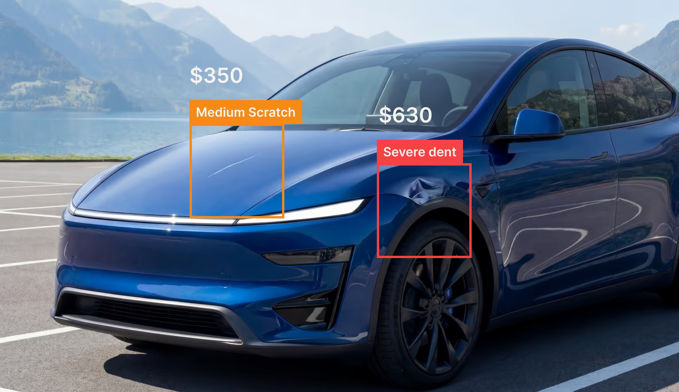
- Show the inspector, the vehicle and the workflow together
- Hold the phone vertically, standing upright
- Use multiple angles — front, rear, sides, close details
- Layer real product UI over vehicle imagery when it explains something
- Use generic stock, staged or overly polished scenes
- Show crouching, bending or awkward posture
- Set it in an office, a repair shop, or a lifestyle scene
- Invent UI overlays that don’t exist in the real product
Approved photography is available on request — email contact@selfinspection.com and tell us where it will run.
Download the brand assets
Every approved logo and symbol variant in vector and raster form, plus a plain-text summary of the rules on this page. One file, nothing else needed.
Questions about brand use — contact@selfinspection.com
